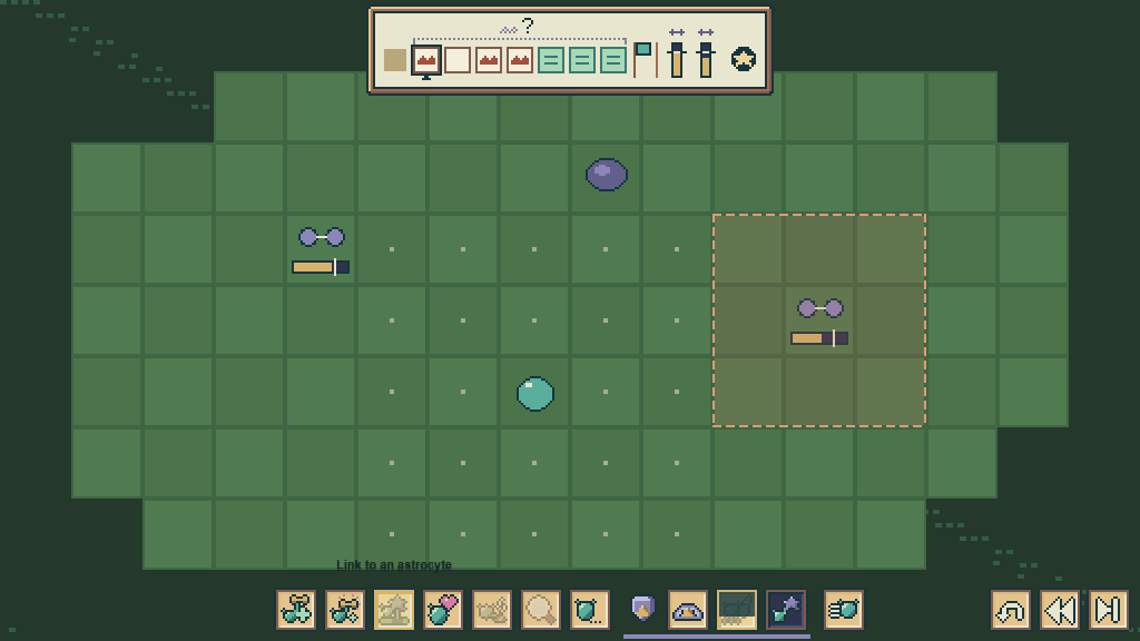
Icon labels are the way Arborwake puts words on screen. On 31 October the user ruled that every icon needs a label on hover and a description on click, because "this is an educational game at its core". That ruling replaced an earlier idea of a wordless interface that named things only on first sight.
How it works#
- The label is the title only. On 1 November the user said a label "can't be one giant textbox". Keys, state, who gave it and reasons all go in the click card.
- It must read at a glance. When a name is evocative, the label leads with a plain glance label of five words or fewer and no numbers.
- It appears on hover, keyboard focus and touch press-and-hold, because touch has no hover.
- It matches the art. Labels sit in the parchment pixel frame, never in a dark browser-style tooltip.
- The click card holds what the thing does, the rule numbers, and a short "in the brain" line.
- Honest labels. A control is never relabelled to sound clearer than what it really does. Check the real function first.
- Inventory tab symbols stay. The user objected when they were swapped for words.
"In the brain" lines#
Each card links the game idea to real neuroscience in one or two sentences. These lines keep the project rule that abilities are fictional mechanics, not real cell phenotypes or clinical claims. Each line is marked with its review state. In the run HUD and the Hearth strain card they are an AI literature check, not an expert review.
All words are hover text#
On 1 November, while playing the turn-based prototype, the user ruled: "In the final build, all the words need to be a hover textbox." No unit names, percentages or turn counts are painted on the board or in the scene. Prototypes may keep debug labels for testing.
Tutorial exception (1 November): "For tutorials, it's best if there's actually text that explain everything… The player knows nothing about the game." Tutorial rooms show full explanatory text, written in naturalised ASD-STE100.
VFX follows the same rule from the other side: effects carry no words at all.
Icon design#
Icons are designed around what a thing does, not its name, and are tested blind with open questions before the user sees them. The Inventory HUD research note records the shared visual vocabulary: you are a teal cell, a friend is a small mint cell with a face, a job is "!", and hidden things have a dotted outline.
Development#
- The rule is used in the Run HUD (approved hover titles and click cards,
60ff21e9) and in the Inventory HUD. - Both interfaces ship in the alpha. A full audit that every label in the alpha follows the rule was not found.
Gallery#
See also#
Sources#
7c54d3631:docs/hud/HUD_AND_INVENTORY.md7c54d3631:docs/hud/HUD_ICON_RESEARCH.md7c54d3631:docs/hud/SCIENCE_CHECK.mda893e4f08:docs/ops/agent-messages/2026-11-01-claude-run-hud.md- docs/ops/agent-messages/2026-11-01-claude-workstreams-todo.md (working copy, not in Git)
What links here (30)
- Art direction
- Astro VFX
- Build VFX
- Care VFX
- Character sprites
- Encounter backgrounds
- Environment art
- Flow
- Hearth podium
- Home art
- Home VFX
- Inventory HUD
- Movement VFX
- Orders VFX
- Palettes
- Panels VFX
- Places dialog
- Pressure front VFX
- Pull and Glide VFX
- Quest scroll
- Quests VFX
- Run HUD
- Studios interior
- Survey VFX
- Tendrils
- Threadway 3D scene
- Typography
- Vessel VFX
- VFX
- Ward VFX